Oriental Mart
Winner of Best Food & Drink Website 2025, UK Ecommerce Awards
Oriental Mart is an oriental supermarket with two physical stores based in Nottingham, UK, and an online store with over 3000 products. After undergoing a rebrand and opening the second store, Oriental Mart approached Digital Six for a full e-commerce website redesign.
User Experience
The current site was quite dated and sometimes confusing for customers. The delivery options are quite complex due to the fresh, frozen and ambient products and customers often didn’t understand them. This caused abandoned carts and fewer sales. The purchase journey and checkout process needed refinement and simplification so that customers were aware of the delivery options and associated costs as early as possible, avoiding any shock later. Information blocks were added to key pages and sections to highlight the delivery options to further inform the customer.
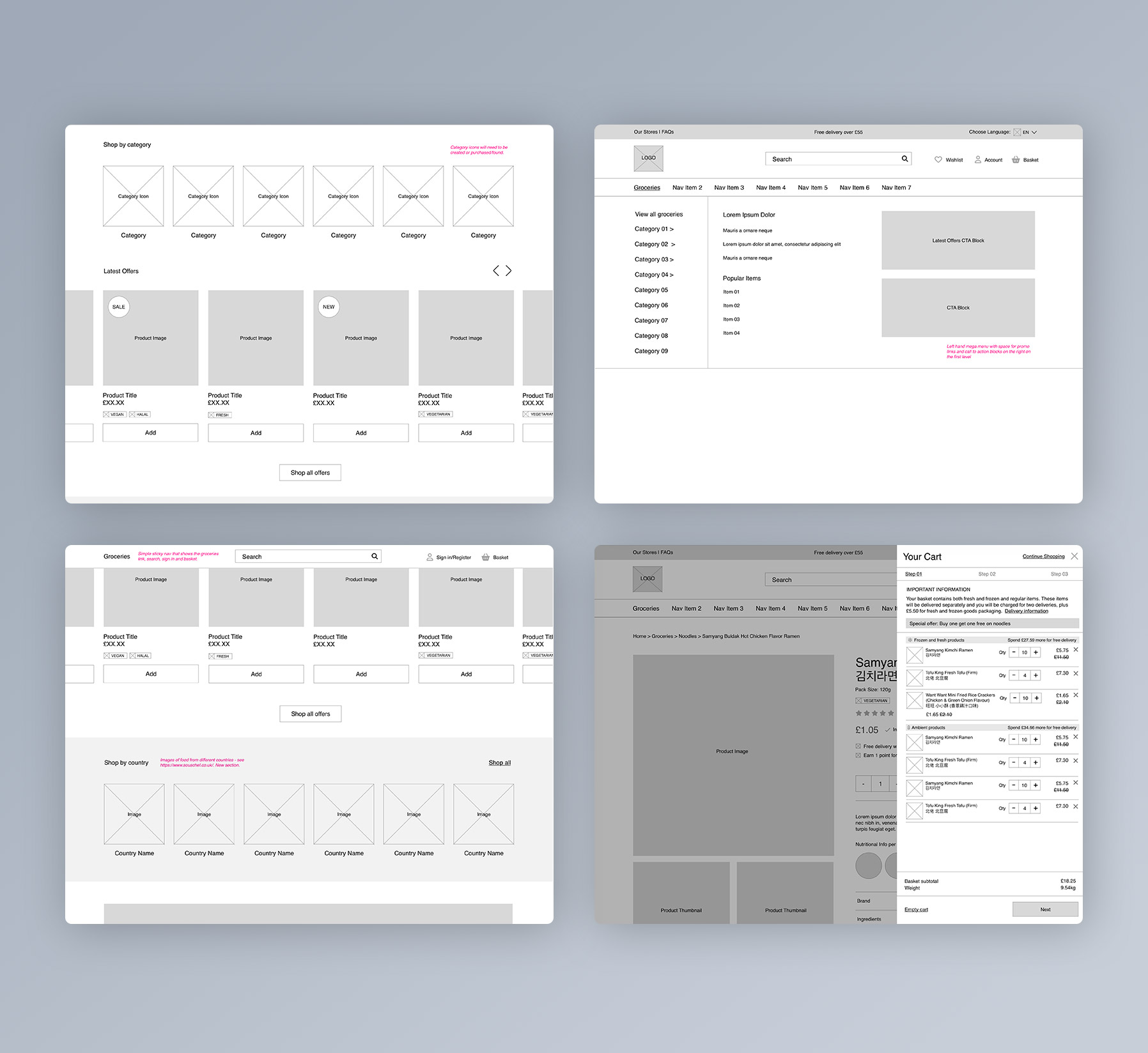
Another challenge was the large product inventory and making sure customers can find what they are looking for as quickly and as easily as possible. A mega menu with sticky navigation including search, groceries dropdown link and basket value ensures that the customer can see their running total and gives them easy access to the menu or to search for products.
Design
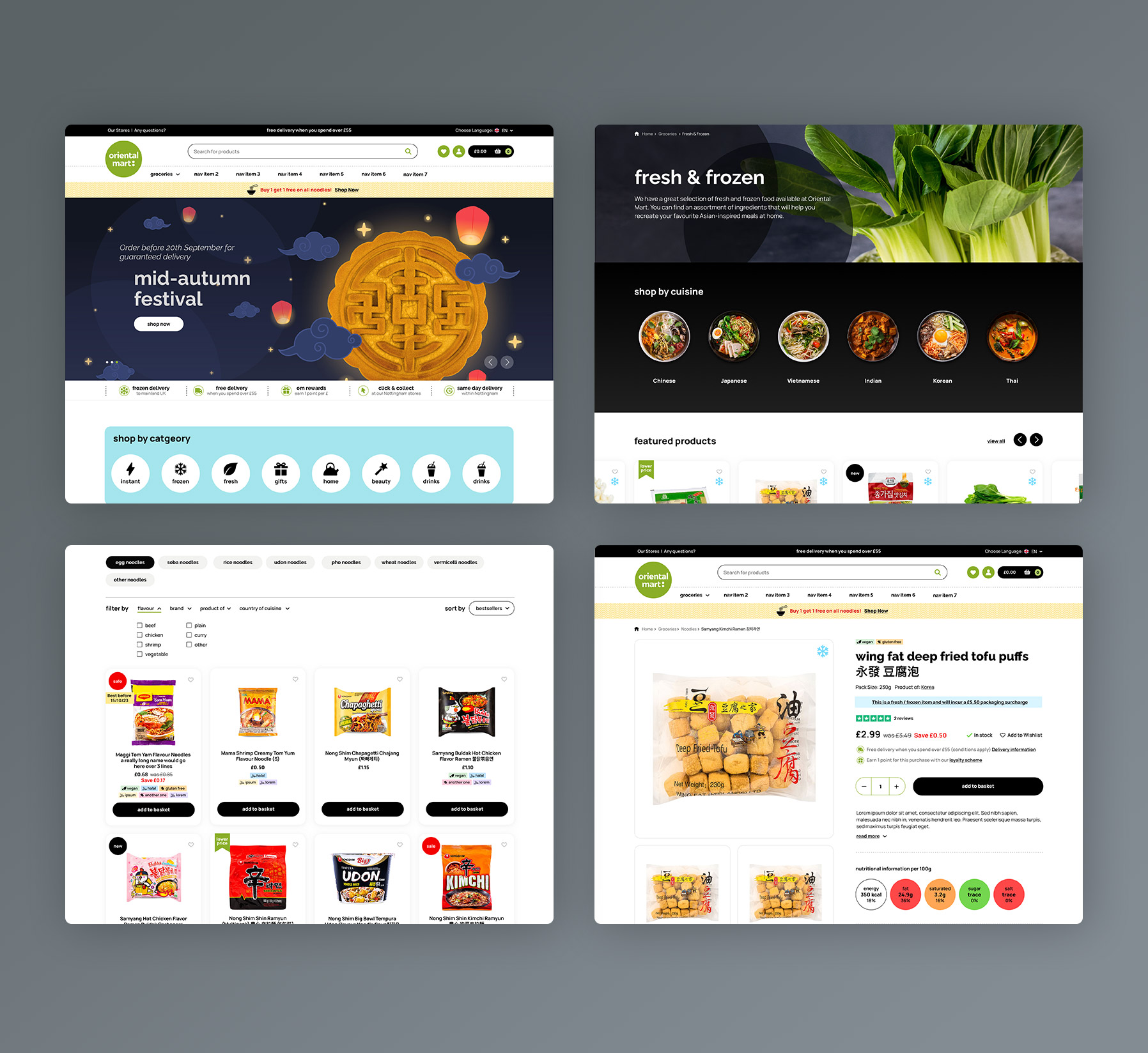
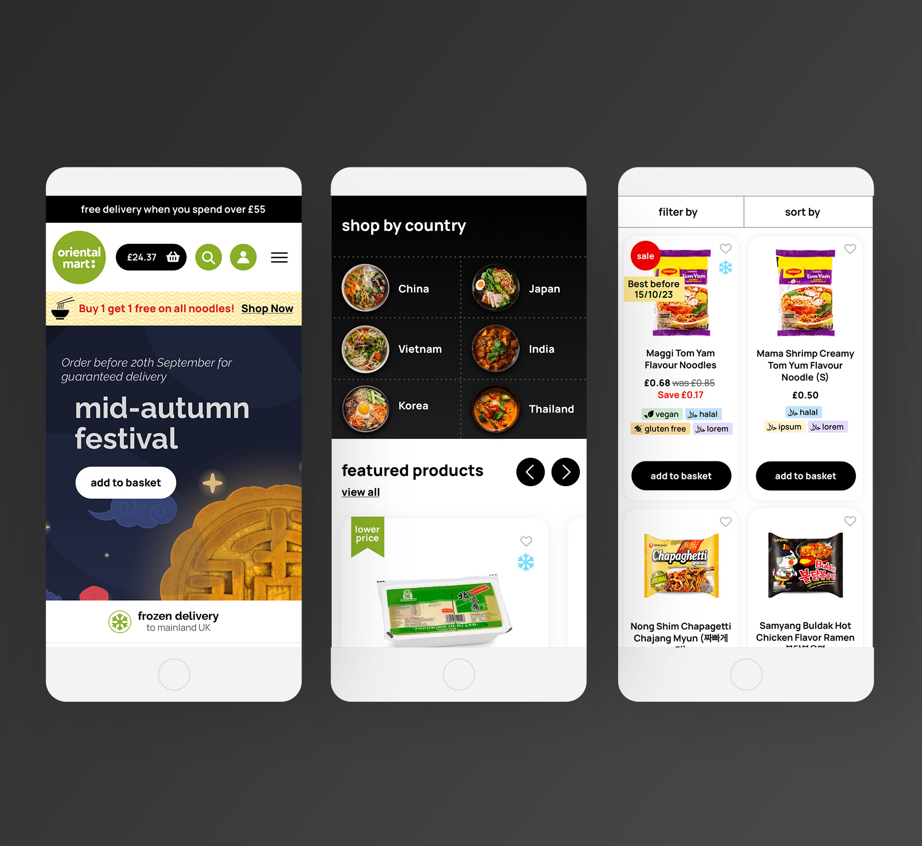
Oriental Mart had recently undergone a rebrand, and they wanted to bring this updated look and feel into their website with a new clean and modern design. The current site was very light using white, yellow and the brand green throughout. With yellow removed from the new logo, the new sites core colours would be green, white and black. I incorporated a lot more black into the design to mirror the modern interiors of the physical stores and to give a more sleek feel to the site. Along with colour, curves and circular shapes were introduced as brand elements, reflecting the circular shape of the logo. Colour was also used to help categorise the products.
“Their well-considered checkout improvements and sleek boutique interface enhanced both user experience and operational efficiency, showcasing a clear strategic vision and strong execution.”
– UK Ecommerce Awards Judges


